
Why a lighter website matters
Web eco-design means reducing the resources a website needs while preserving its usefulness. A downloaded file or a running task uses a device, a network and servers. Manufacturing this equipment requires raw materials, and running it requires electricity. Avoiding unnecessary loading reduces the work needed to provide the same service.
For visitors, this matters in everyday situations. Reading an offer on a limited mobile connection, browsing an article on an older phone or opening a form should remain possible without waiting for an animation or a video they do not need. Lighter pages help keep these journeys accessible while demanding less data and processing power from devices.
Avoid unnecessary processing
Targeted scripts avoid making the processor work without a useful purpose.
Send only the data needed
Right-sized images and on-demand videos ease loading on slower connections.
Support older devices
A lightweight page asks less of the phone's available memory.
At Appik Studio in Lausanne, we applied this approach to a new version of our homepage. The prototype reached an A grade on EcoIndex, scoring above 80/100.
Our aim was to retain useful content, visual quality and contact journeys. The following choices can also help an SME, an institution or a product team design a website that uses fewer resources.
What does EcoIndex measure?
EcoIndex is an indicator from 0 to 100 that assesses a page through its structure, requests and transferred data. A higher score means the page uses fewer resources according to this model.
The scale runs from A, the best grade, to G. Under the GreenIT grading scale, a score strictly above 80/100 receives an A grade. Our prototype therefore falls into this category.
Appik Astro homepage
EcoIndex grades, from 0 to 100
- A80 < x ≤ 100
- B70 < x ≤ 80
- C55 < x ≤ 70
- D40 < x ≤ 55
- E25 < x ≤ 40
- F10 < x ≤ 25
- G0 ≤ x ≤ 10
Our result
80.01 / 100
GradeA
| What you can reduce | What it represents | A practical starting point |
|---|---|---|
| Page elements | The structure the browser has to build | Simplify nested blocks and repeated elements |
| Requests | The files the browser fetches | Avoid unnecessary loading and share resources |
| Transferred data | Images, fonts, scripts and other files | Adjust their format, size and loading time |
The score applies to a page and a test scenario. It does not directly measure electricity consumption or represent the entire environmental impact of a digital service. Its main use is identifying avoidable sources of page weight.
What does the GreenIT sample tell us?
The 2025 GreenIT/Razorfish barometer provides a concrete reference. Its sample of 90 French websites had a reported average of 25/100. The results cover the ten most visited pages on each site, 900 URLs in total, rather than the whole web.
GreenIT/Razorfish panel, France, 2025
- Whole panel90 sites25 / 100
- CAC 40 corporate websites40 sites35 / 100
- E-commerce websites50 sites18 / 100
Mean EcoIndex scores for a panel of 90 sites and 900 URLs. This panel does not represent an average for the entire web. Multi-page journeys cannot be compared directly with a single homepage.
Sources: 2025 findings · Barometer and methodology
The sample includes large institutional and e-commerce websites. It shows room for improvement in these journeys; it does not allow a direct comparison between their average and a single homepage.
Show relevant work and keep every project accessible
A homepage does not need to present an entire portfolio in the same detail. It should help visitors find relevant examples quickly, then explore them further.
We selected a few representative projects for the homepage, with access to the full catalogue of 23 projects and their dedicated pages. The same principle applies to client reviews and the team. A few examples give visitors an initial impression; clear links let them see more.
This structure reduces images and repeated blocks on the first page. It also gives detailed information a clearer place. Visitors and search engines can still access the content through ordinary links, without relying on a carousel click or a complex interaction.
Before adding a section, ask which decision it helps the reader make. A well-chosen example linked to a detailed case study may be more useful than a long sequence of cards.
Load interactions when they become useful
A website may have a menu, an FAQ, a form, an estimation tool and animations. That does not mean visitors need to download all their dependencies as soon as they arrive.
We experimented with an Astro homepage. This architecture serves most of the page as HTML and reserves JavaScript for interactive parts. Text and links are available immediately; a heavier feature can load when it becomes necessary.
Astro's documentation on islands explains this principle. Astro is an option, not a requirement for web eco-design. A Next.js page or another website can also improve through better separation of components and loading.
The right choice depends on the product. An editorial website and a business application used throughout the day have different needs. We choose an architecture that supports real user journeys rather than recommending migration as a matter of course.
Keep attractive images and carefully chosen typography
Reducing media weight starts with adapting it to its use. A portrait in a small card does not need the dimensions of an image intended for print. An illustration on mobile does not need the same file as one on a large screen.

Modern formats, responsive images and visually checked compression can reduce transfers while retaining the details that matter. Images further down the page can wait until visitors approach them. The main image, if visible on arrival, should instead be available quickly.
Fonts deserve the same attention. Each weight or variant can add a file. We checked which styles were actually used and whether they could share a resource, while preserving their appearance and line breaks.
Validation happens on screen. A smaller file that damages a logo, makes text hard to read or shifts a button is a poor optimization.
Give the website character without constant animation
An animation can explain, guide or give a website its identity. Its cost depends on its duration, technique and trigger.
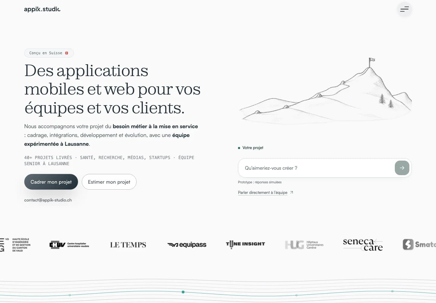
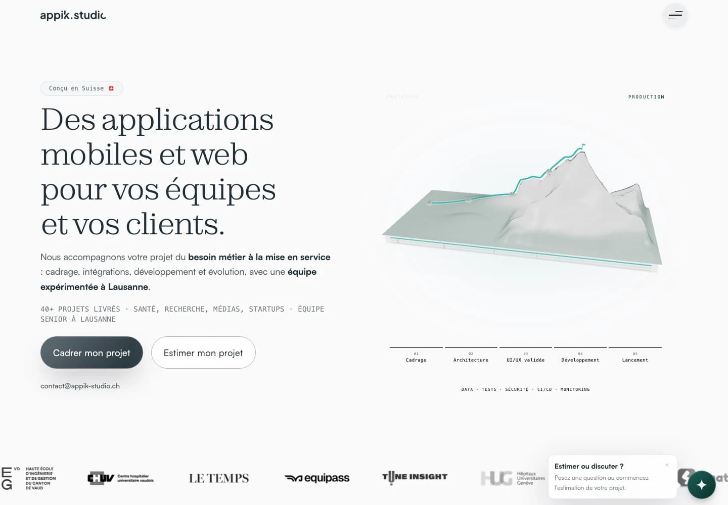
For our homepage, we explored a pencil-drawn Swiss mountain that gradually takes shape. It replaces a heavier 3D scene while retaining the idea of ascent and building a project.
Once the drawing finishes, the page can rest. Visitors who request reduced motion should have an adapted version. On mobile, decorative interactions should not interfere with scrolling or typing.
This restraint gives more room to the content and the main action. The visual detail remains, with a specific role in the experience.
Where should you start with your website?
A useful audit begins with pages that matter to your visitors, such as the homepage, a service page, a client case study and the first point of contact.
- Measure these pages in a reproducible scenario on an identified version.
- Identify repeated blocks, the heaviest files and loading that serves no immediate purpose.
- Choose an improvement that preserves the content and intended journey.
- Check the appearance, interactions, accessibility and links in the site's languages.
- Measure again with the same parameters, set a page weight limit and check future changes against it.
You can start with the existing website. A full redesign becomes relevant when the architecture, content or user journeys genuinely limit progress.
Frequently asked questions about web eco-design
Does an eco-designed website have to be minimalist?
It can retain a strong visual identity, illustrations and interactions. The question is how useful they are and how to limit the resources they require. A carefully designed experience can use few files and occasional animations.
Do you need to remove content to improve EcoIndex?
Start with repetition and unnecessary loading. Moving detailed content to dedicated pages can lighten the homepage while keeping it accessible. Links, useful text and the quality of the journey still need checking.
Do you need to switch to Astro?
Astro suits mainly editorial pages because its architecture makes it easier to limit JavaScript. It is not mandatory. Assess the expected benefit against migration costs and the needs of interactive features.
Does a score of 80 prove an 80% reduction in emissions?
No. EcoIndex is a score, not a percentage of avoided emissions. Hosting, devices, traffic and usage also matter when assessing the wider impact.
A website that supports your business with fewer resources
Are you planning a new platform or looking to lighten an existing website? At Appik Studio, we connect web development decisions to your users' needs, integrations and product continuity.
Let's discuss your project. A few representative pages and your priority journeys are enough to start identifying useful improvements.



 Swiss Made Software
